
Over the holiday shopping season, it became clear that m-commerce isn’t showing any signs of slowing down!
With retail sales on mobile devices set to reach $415bn by the end of 2016 and experts suggesting that nearly half of all ecommerce will take place on mobile by 2018, shopping via smartphones and tablets will be the real game changer for online retailers this year.
And while most ecommerce players have already successfully initiated their mobile commerce strategies, 2016 requires a key focus on specific mobile features, so that retailers can provide their customers with an extraordinary mobile shopping experience.
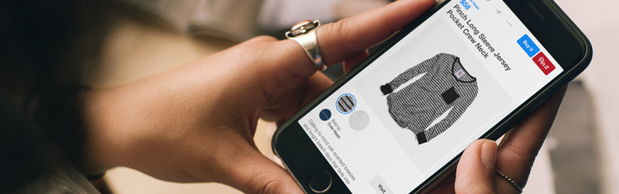
Although mobile commerce is clearly on the rise, its conversion rates are still behind desktop. Mobile devices have smaller screens, which can make product details harder to find and payment forms harder to fill, resulting in high levels of cart abandonment.
So, in 2016, online retailers should look to incorporate seamless payment services into their mobile checkout pages, which include fewer form fields and provide shoppers with a cleaner user experience.
Although smartphones and tablets will be the clear leaders when it comes to the online purchasing process over the next few years, omni-channel shopping will also become increasingly popular.
Retailers hoping to stay ahead in 2016 should provide an integrated mobile experience, both online and offline. So as well as making mobile payments as simple as possible, additional product finding and ordering features should be incorporated in your mobile strategy, to support offline shoppers.
With mobile traffic expected to overtake desktop, most online retailers are already aware that ecommerce stores need to be optimised to offer high-resolution and user-friendly touch control options. Fully mobile-responsive designs, which enable seamless shopping experiences on any device, are also a must to draw in the increasingly savvy consumer.
However, the incredible diversity of smartphones, tablets and other mobile wearables makes it almost impossible for online players to target individual devices, since the device itself is no longer a clear indication of the size of the display.
In 2016, using screen size instead of device classification as criteria when developing responsive store designs, is one of the mobile-friendly design best practices for retailers who want to take full advantage of the mobile sales opportunity.

Let us develop a tailored solution for your business that will help you reach new international customers and grow your global sales.
get in touch